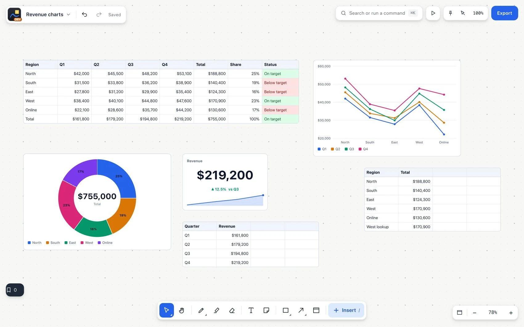
Data and calculations
Create linked charts and indicators
A represents a range of a data table. It stays linked, so it changes when the source is updated. A big number shows a highlighted figure. A progress bar represents a value as progress.
- Select a data table and the range you want to represent, with its labels and numeric series.
- Choose Create chart in the contextual controls.
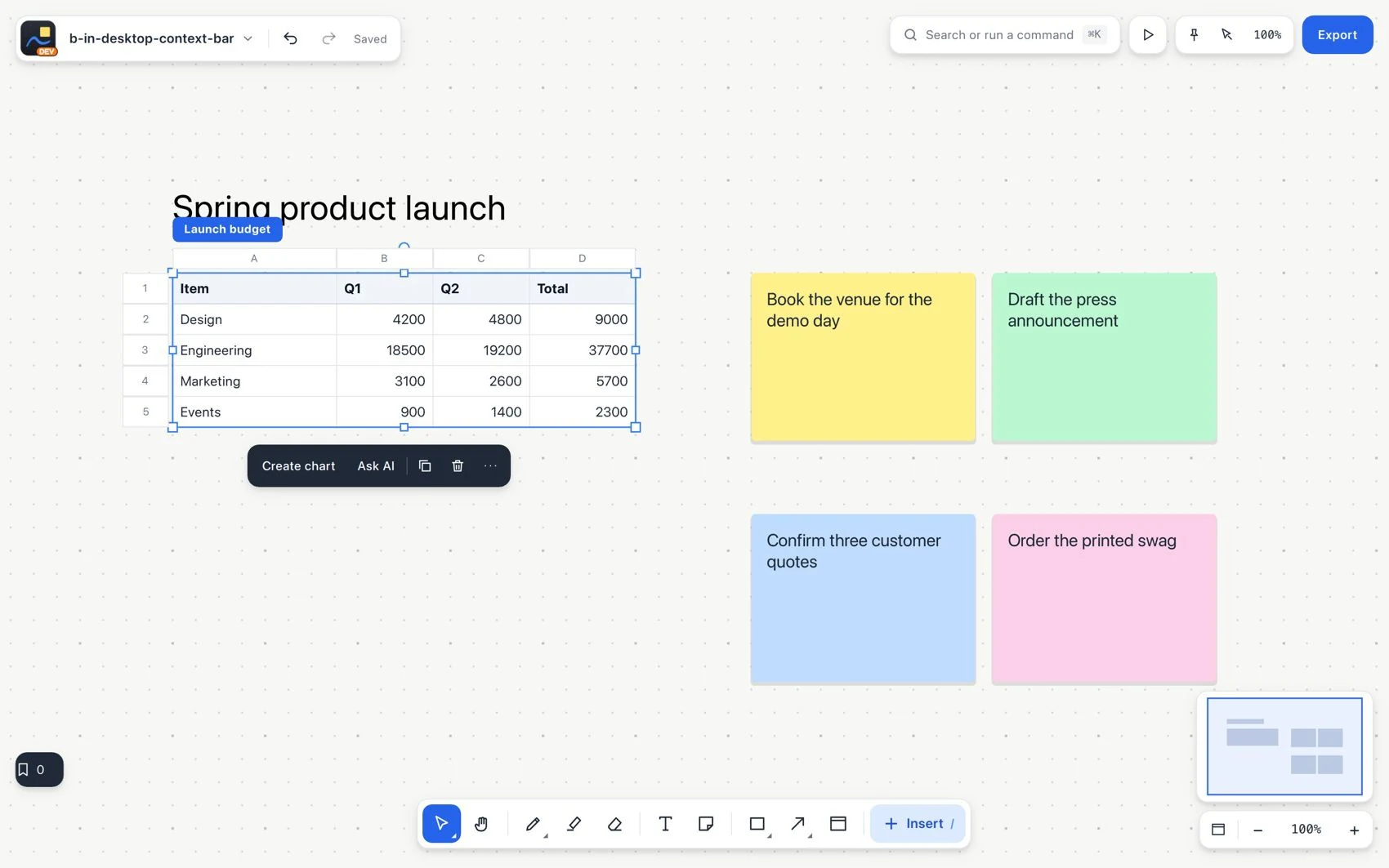
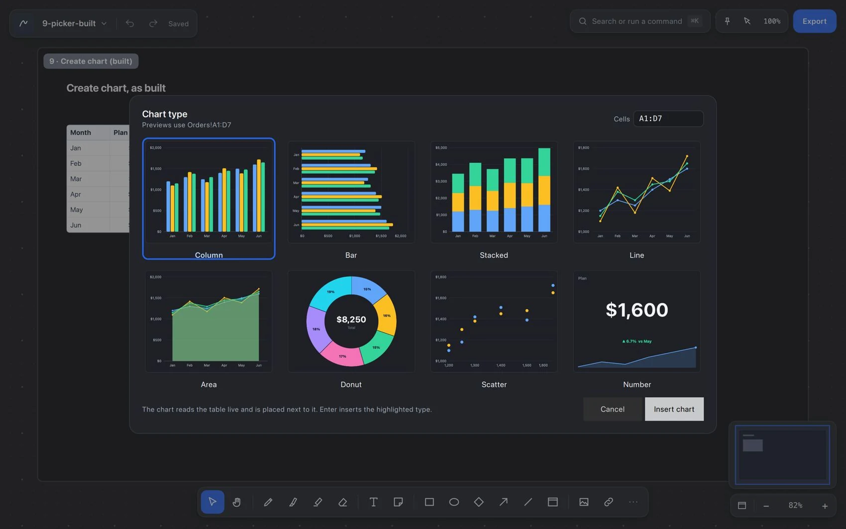
- Pick bars, lines, areas, donut, scatter or big number. Choose based on the question you want to answer, not only on appearance.
- Define the series and place the chart next to the explanation, in a section or in a document.
- Change a source cell and check that the chart, the totals and the linked text update.
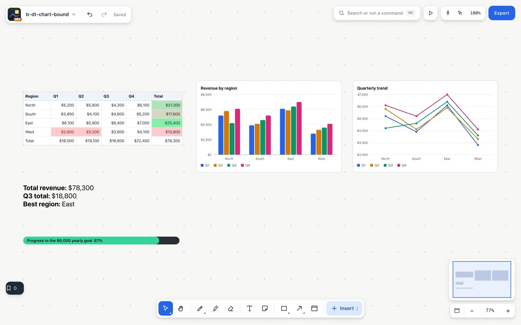
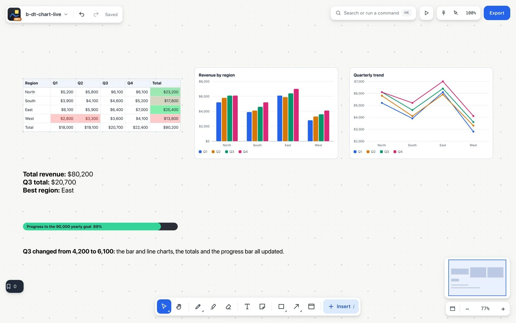
See an update across all its results
| Type | Question it helps answer |
|---|---|
| Bars | How do the categories compare? |
| Lines or areas | How does a value change over an ordered sequence? |
| Donut | How is a total divided? |
| Scatter | How do two numeric variables relate? |
| Big number | What is the total or the main metric? |